


The introduction of media queries was the savior and pinnacle of web responsiveness. Without it, we would still be stuck with building websites for different screen sizes.
However, specifying media queries for different screen sizes when developing a website can add unnecessary codes that can make CSS debugging a nightmare. To overcome this, let's see how using a CSS in-built function called the "min()" function can help.
As the saying goes — seeing is believing, so here is a video example of how website responsiveness can work effectively by using min().
Now, according to MDN,
The
min()CSS function lets you set the smallest (most negative) value from a list of comma-separated expressions as the value of a CSS property value. Themin()function can be used anywhere a<length>,<frequency>,<angle>,<time>,<percentage>,<number>, or<integer>is allowed.
What this means is that the min() function accepts a variety of units (%, rem, px, vw) and returns the one that is the smallest. This value is then set as the value of a CSS property.
The min() function is a really powerful CSS feature that can be used to style lots of elements that need to scale perfectly to fit different screen sizes. Some CSS properties like width, font size, margin, padding, gap, etc should not have a fixed size when dealing with a responsive website.
Did You Know
The
min()function has a sibling called themax()function. Themax()function returns the biggest value passed to it.
Font Size Responsiveness
Here is an example of a min() formula that can be used to make the font size of a website as responsive as possible:
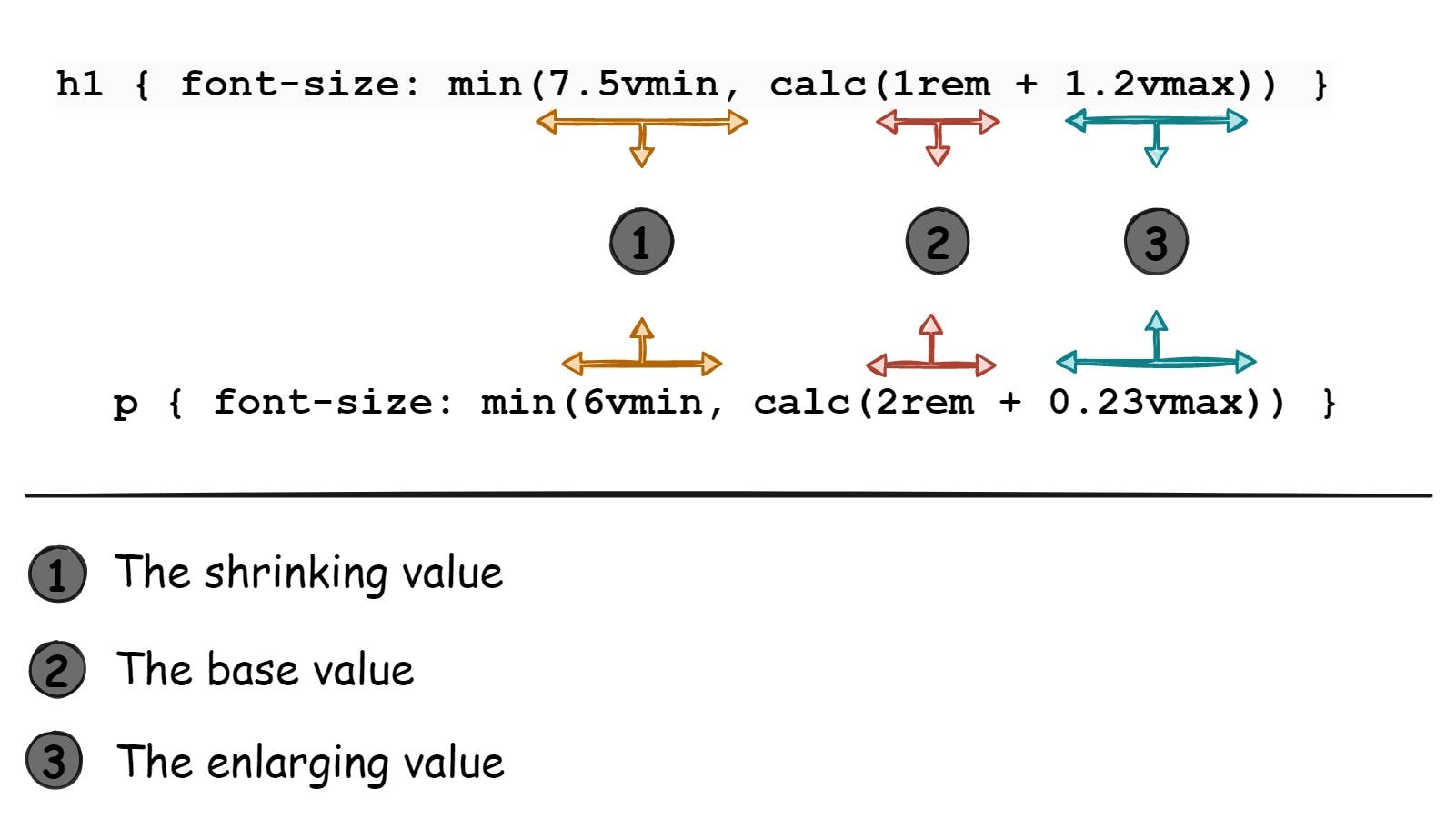
font-size: min(6vmin, calc(1rem + 0.23vmax));
The min() sets the smallest value between these two values, 6vmin and calc(1rem + 0.23vmax) as the value for the font size CSS property.
The 6vmin value is 6% of the smallest part of the viewport, which can either be the vw (viewport width) or vh (viewport height). By using vmin, we are able to reduce the font size to fit any small screen. This helps the font size to scale as minimum as needed.
The calc(1rem + 0.23vmax) is a derived formula that has been tested and has proven to efficiently increase the font size in accordance with the viewport size. The value of 1rem is the preferred base font value.
As the screen size grows, 1rem becomes too small for big screens; so a tiny fraction of the largest viewport dimension, i.e 0.23vmax is added to 1rem using calc(). By adding these two values, we can guarantee that the font size will increase bit by bit as the screen size increases and still remain readable without becoming too large.
Now we could have just used different media queries to make sure an element is responsive, for example:
p {
  font-size: 1.1rem;
}

@media (min-width: 1200px) {
  p {
    font-size: 1.2rem;
  }
}
@media (max-width: 350px) {
  p {
    font-size: 0.9rem;
  }
}
This would work fine, no problem. However, when a user uses a smartwatch or a large screen (say, 200 inches) to access your website, both media queries applied won't work properly because the font size would be too small for the large screen and too large for a smartwatch.
Instead, just one line of code like this would fix this problem:
p { font-size: min(6vmin, calc(1rem + 0.23vmax)) }
This adjusts the p tag's font size to shrink and enlarge as much as needed, depending on the screen size, all without using a single media query.
Quick tip:
You can include the maximum value to the
min()that a tag property should have:p { font-size: min(6vmin, calc(1rem + 0.23vmax), 2rem); }With this fix, the
ptag's font size would undergo the usual shrinking and enlarging but would stop enlarging once it reaches 2rem.
Headers Responsiveness
Headers typically need to be larger than regular text to be noticeable, so simply using the same min() formula provided may result in headers being too small. To compensate, you may have to make a few tweaks, like increasing the vmin and vmax values in the min() function for headers. For example -
h1 {
  /* font-size: min(6vmin, calc(2rem + 0.23vmax)); */
  font-size: min(7.5vmin, calc(2rem + 1.2vmax));
}
Because headers are larger than regular texts, the vmax value was raised from 0.23vmax to 1.2vmax and the vmin value was raised from 6vmin to 7.5vmin. This ensures that the difference between headers and regular texts is noticeable.
Generally, this is the formula I use when dealing with regular texts and headers:
This formula has always made any text on websites I design responsive. You could also experiment by tweaking the values to see how they could fit perfectly in your code; you never know, you might come up with a much better formula.
Margin & Padding Responsiveness
To ensure fluid margin and padding responsiveness, it all boils down to which type of unit is used. Using fixed units like rem or px for margins and paddings doesn't go as planned as soon as responsiveness steps in.
The min() function allows you to set both a relative unit and a fixed unit, with the fixed unit acting as a threshold to prevent the margin from exceeding a certain value, which may occur due to the relative unit increasing in size.
For example, instead of setting only a fixed margin of 30px, you can use:
div {
  /* margin: 30px; */
  margin: min(10vmin, 30px);
}
This sets a value of 10vmin or 30px; whichever is greater would be used as the margin value. In smaller screens, the margin would be 10vmin which would shrink correctly with the screen size, and as the screen grows and 10vmin becomes equal to the size of 30px, the 30px is then used as the margin, and it eventually stops increasing in size.
Pro Tip
When using paddings, use the
emunit whenever possible. Becauseemis dependent on the font size of its element or its nearest ancestor with a specified font size, it would scale perfectly with how the font size scales. This only works if the font size scales as well.For example, consider a div with
font-size: min(6vmin, calc(1rem + 0.12vmax));andpadding: 1.2em;. This would ensure that the padding would always scale relative to how the font-size scales. If the font decreases, the padding decreases as well; if the font increases, the padding increases.
Width Responsiveness
Making width as responsive as possible is less tedious than dealing with font size. Most times, developers want an element's width to fill the viewport width, or 100% of its container, while also preventing it from growing beyond a certain size. There are two ways to go about this:
div {
  max-width: 700px;
  width: 100%;
}
/* Or */
div {
  width: min(100%, 700px);
}
Both codes work the same way, using min() instead of max-width is just an easier way to write the code.
However, the width of regular text on your website should also be taken into account. There's a rule that governs the width of texts to prevent them from becoming too long on a line, as it becomes difficult to read.
To control how many characters should fit on a single line before wrapping to the next, the unit ch is used. The recommended value for ch is between 50 and 75 characters per line, but this can change depending on how your website is designed.
p {
  width: min(100%, 50ch); /* Max 50 characters */
}
Custom Responsive Values List
The following are pre-defined custom values that I use to style font sizes, margins, paddings, widths, gaps, and other elements. These values have been defined as CSS custom properties that can be used with the var() function. Although you could simply copy and paste them into the appropriate CSS property — your choice.
:root {
  --font-size-6x: min(7.5vmin, calc(2rem + 1.2vmax));
  --font-size-5x: min(6.5vmin, calc(1.1rem + 1.2vmax));
  --font-size-4x: min(4vmin, calc(0.8rem + 1.2vmax));
  --font-size-3x: min(6vmin, calc(1rem + 0.12vmax));
  --font-size-2x: min(4vmin, calc(0.85rem + 0.12vmax));
  --font-size-1x: min(2vmin, calc(0.65rem + 0.12vmax));
  --width-2x: min(100vw, 1300px);
  --width-1x: min(100%, 1200px);
  --gap-3x: min(5vmin, 1.5rem);
  --gap-2x: min(4.5vmin, 1rem);
  --size-10x: min(15vmin, 5.5rem);
  --size-9x: min(10vmin, 5rem);
  --size-8x: min(10vmin, 4rem);
  --size-7x: min(10vmin, 3rem);
  --size-6x: min(8.5vmin, 2.5rem);
  --size-5x: min(8vmin, 2rem);
  --size-4x: min(8vmin, 1.5rem);
  --size-3x: min(7vmin, 1rem);
  --size-2x: min(5vmin, 1rem);
  --size-1x: min(2.5vmin, 0.5rem);
}
/* The custom properties prefixed with "--size-" are used mostly for margins and paddings. */
These values can be tweaked as needed. So, feel free to adjust the values to suit your specific needs.
Possible Questions
Can
clamp()be used instead ofmin()?Yes, the CSS
clamp()function can be used in place ofmin(). However,min()is much more favorable becauseclamp()only accepts three values (a minimum, a preferred value, and a maximum), unlikemin()which accepts as many values as needed.Can another
min()be used inside amin()?Yes, you can embed a
min()function inside anothermin(). Other CSS functions likeclamp(),min(),max(), orcalc()can also be used insidemin().For example,
min(min(5px, 1vw), calc(10vh - 20px), max(10%, 15px), 10rem)is perfectly valid in CSS. But beware, you could get confused easily, so tread with caution.Does using
min()imply that media queries are no longer required?No, media queries are still essential for the responsiveness of modern websites. However, if the
min()function is well utilized, you would need just a few media queries in your code.For instance, when working with CSS properties that don't use units like display or position, you're definitely going to need media queries.
What can be used to check the effect of changing the
min()values?Use the developer tools of your browser to better visualize and understand how changing each value in
min()would affect the element's size.You can instantly see how your website will scale to different screen sizes by switching to responsive mode in the developer tools.
Is
min()supported on all browsers?
At the time of this writing, min() is supported in 96% of all browsers, which is more than enough.